Pharma logistics website design for Tek

Website and brand development for pharma logistics

Client: Tek

Completed: May 2025

White line icon of a microscope on a blue background
Close-up of a syringe drawing liquid from a medical vial
Van visual with the message “Delivering life science on time and in temperature”
Tek logo on the side of a blue delivery van outside a warehouse
Graphic showing “+1m annual shipments (90% cool)”
World map graphic with location pins marking delivery locations

Insight

Tek are specialists in pharma and bioscience logistics. They came to Union 10 after seeing our work for Emas Pharma, looking for the same level of clarity, trust and polish — delivered through pharma logistics website design that feels professional and easy to navigate.

Our brief was to develop their brand design and build a new website first, with marketing collateral to follow.

Brand development

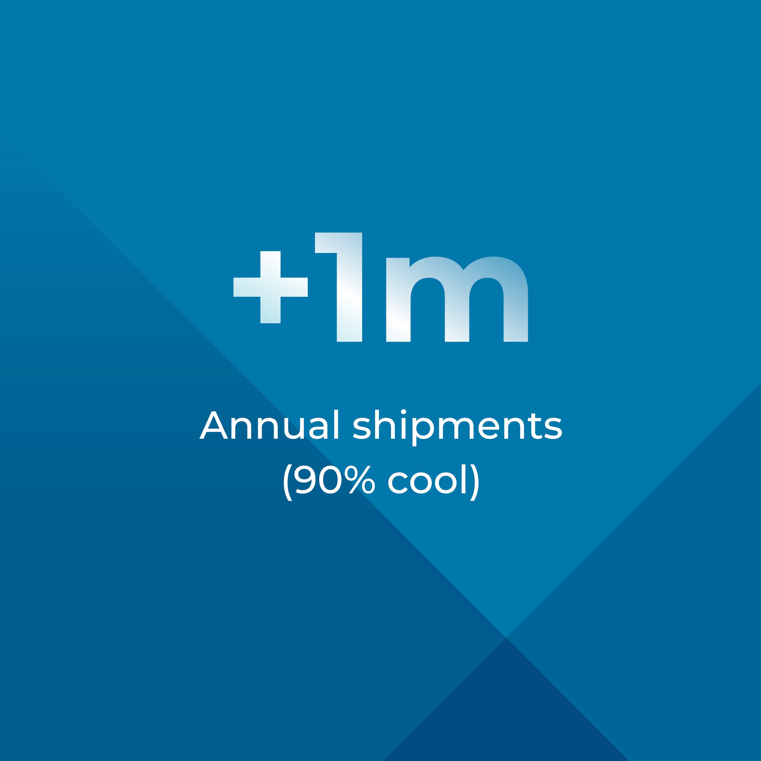
Pharma logistics is highly regulated, so every touchpoint needed to communicate trust, control and professionalism. Tek Freight’s core value is their ability to deliver on time while keeping cargo at a specific temperature, so we made their strapline — “Trusted to deliver on time and in temperature” — central to the brand and website messaging.

Their logo already had a strong simplicity, with a distinctive arrow cut into the “k” to suggest movement. We took that detail and built a repeatable design system from it, using the arrow angles to structure layouts and create a bold pattern that runs throughout the site — giving the brand a striking, ownable framework.

To support rollout, we created a flexible set of brand assets — patterns, icon styling, layout rules and supporting graphic elements that keep the identity consistent across print and digital.

Pharma logistics website design

Logistics websites can often feel rigid and generic, especially in regulated sectors. Our goal with this pharma logistics website design was to give Tek a clear brand personality that translates seamlessly from business cards and van livery through to the digital experience.

The hero area uses the angular pattern to create structure and impact, while the arrow motif acts as a directional cue, subtly guiding users through each page. We gave icons and buttons rounded edges to echo the Tek logo typography, and introduced dot elements to create a simple logistics-map texture — adding depth without distracting from the message.

All of this sits within a considered web design approach, prioritising clear hierarchy, fast scanning, and straightforward journeys to the information users need.

Copywriting

As with many of the sites we produce, we supported the project with copywriting — taking time with the client to understand how they operate, refine the key messages, and structure content in a way that’s quick to scan.

Rather than asking users to wade through long blocks of text, we broke the story into clear sections and introduced “Key Facts” panels to surface proof points — including stats like “30+ million miles covered” and “200+ hours dedicated to driver training” — credible, relevant information that builds confidence fast.

Support and maintenance

Find out more about our maintenance and support services.

Built in WordPress, the site is easy for the client to manage internally. We provided full CMS training so Tek could confidently make edits, publish updates, and keep the website evolving alongside the business.

Written by Jane Comar + Reviewed by James Hofton

Last updated: February 20, 2026

Get in touch


Talk to us about your next project. We’d love to hear from you.