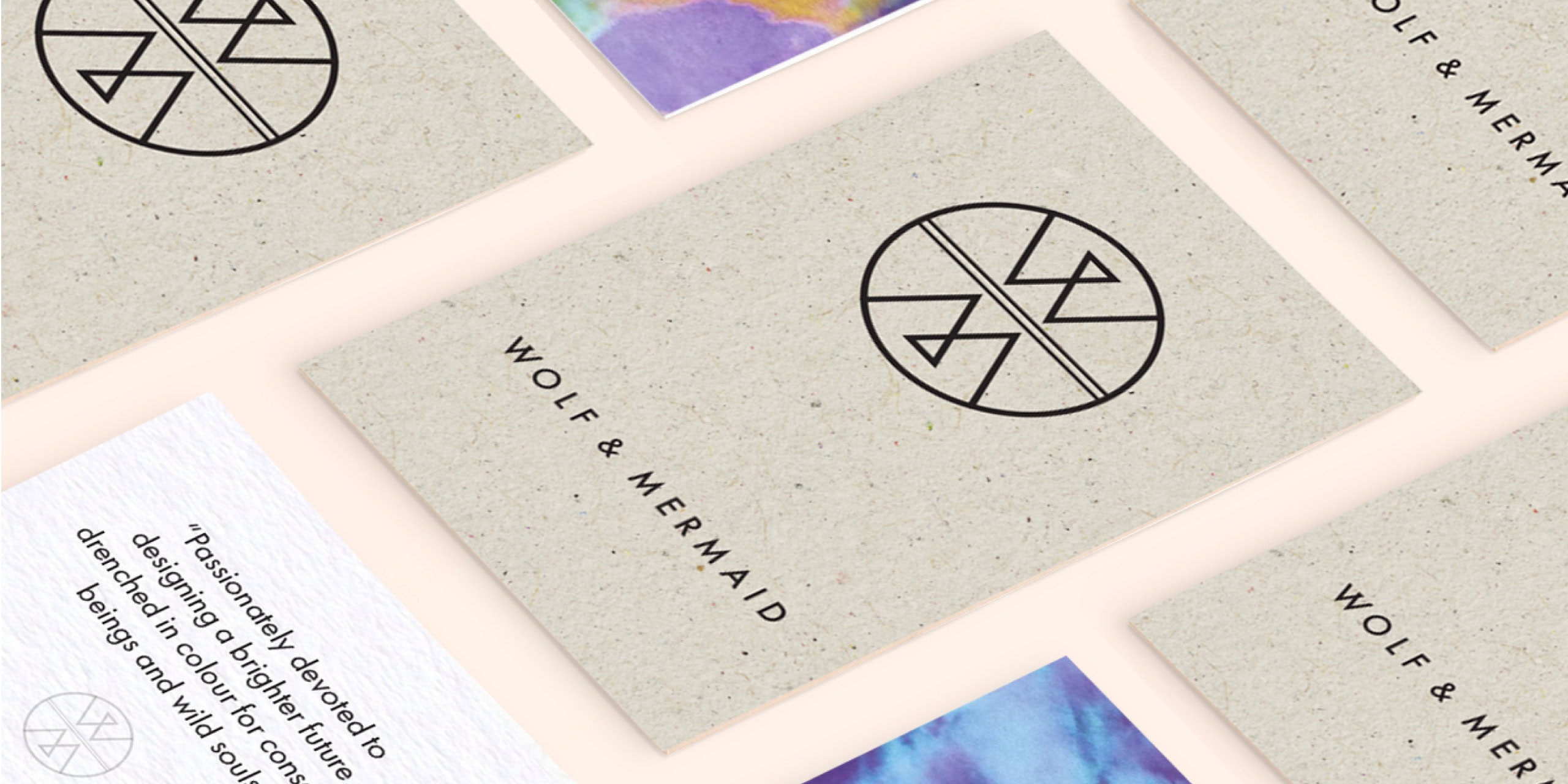
Wolf and Mermaid’s brand story is rich with symbolism. A land-based Wolf unites with a sea-dwelling Mermaid — two opposing forces coming together to protect and heal the planet. Land meets sea; dark meets light; strong meets soft; action meets calm.
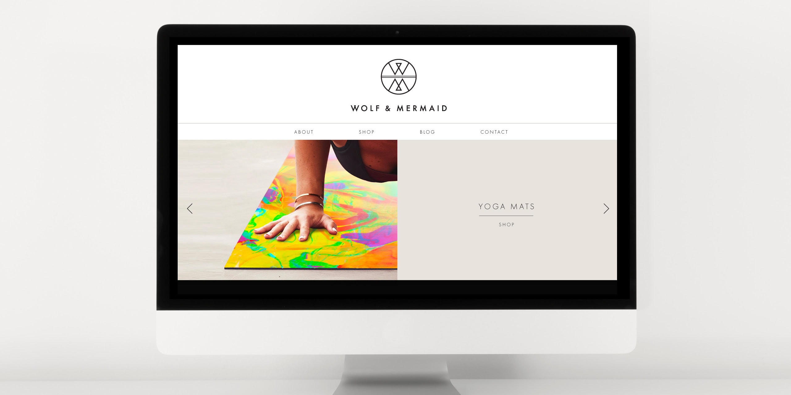
Our logo design needed to capture that balance in a way that felt modern, memorable and easy to apply. Using icons to represent the initials W and M, we created a mirrored mark that reflects two forces aligning — distinct in concept, but clean and minimal in execution.
Because the logo would be used across physical products, it also had to work hard in the real world. We considered everything from scale and spacing to screen printing and material finishes, ensuring it could be reproduced clearly across the full range.
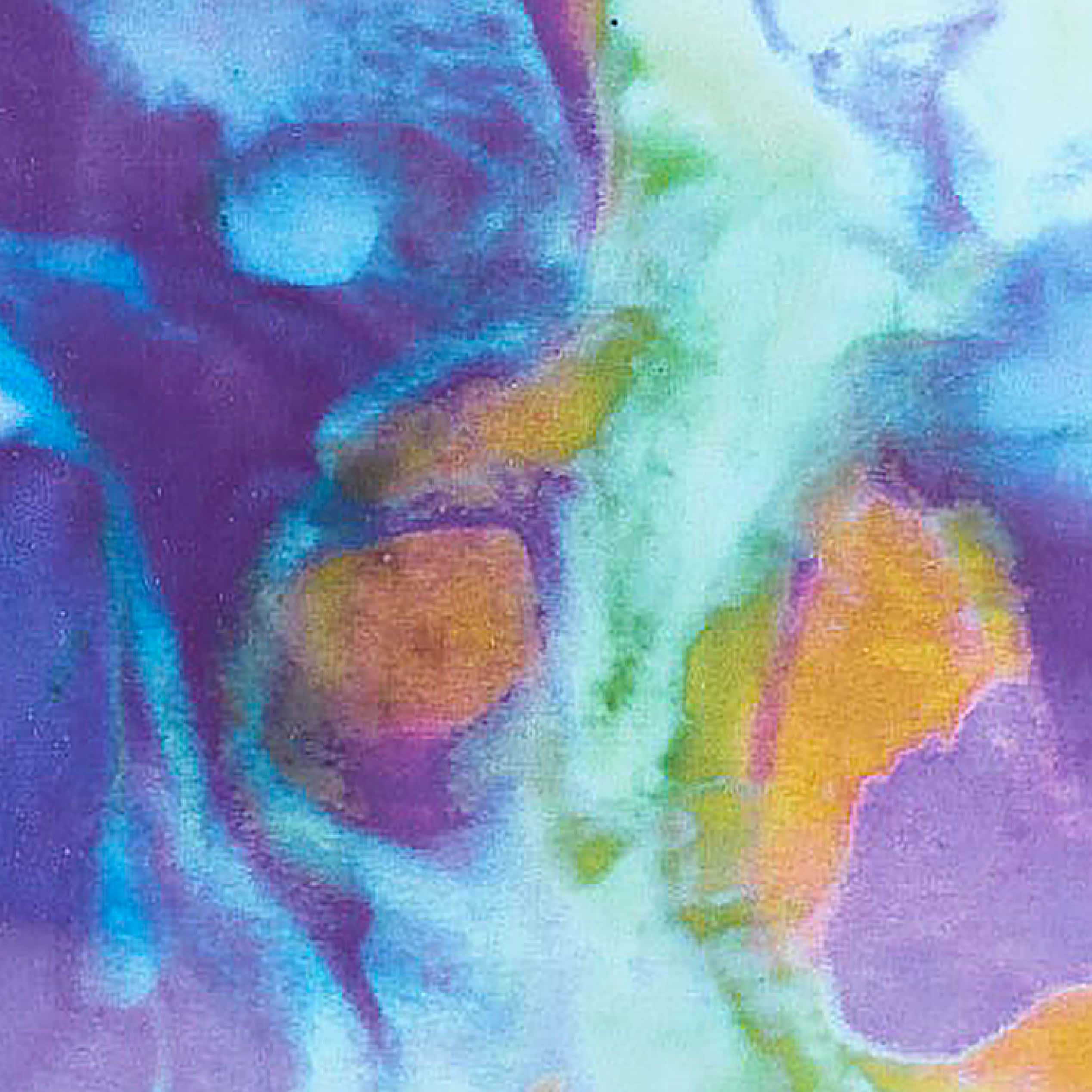
We then extended the identity into a simple, refined system: a monochrome palette, clean typography, and plenty of breathing space — giving the colourful yoga designs room to shine.